
Edward Tufte’s classic The Visual Display of Quantitative Information is the Strunk and White of data visualization. This book deals with the theory and practice in the design of data graphics and makes the point that the most effective way to describe, explore, and summarize a set of numbers is to look at pictures of those numbers, through the use of statistical graphics, charts, and tables.
Top Notes from Tufte:
- Less is more. “Above all else show the data” (p. 92). Erase everything you don’t need.
- “Graphical excellence consists of complex ideas communicated with clarity, precision, and efficiency.” (p. 51)
- Keep it proportional! “Lie Factor = size of effect shown in graphic divided by size of effect in data” (p.57). Keep it close to 1.
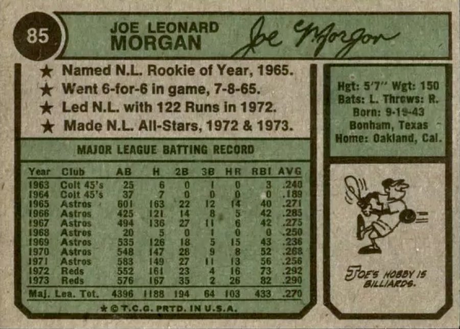
- You don’t have to use a graphic when there isn’t much data — a table is often better.
- Pie charts are useless.
While Tufte uses several graphics to make his point, he somehow skipped over the backs of old baseball cards, which really hit home (pun intended) what he is trying to say. For example, see the Joe Morgan card below:
About the Author



Of course it's his business how much water the concrete plant uses. This is still America, afterall. And where are…
It is none of your damn business how much water the concrete plant uses. You seem like a busy body.…
According to the Cape Charles Mirror (10/11/26), in the article on “Cape Charles Advances Municipal Building, Harbor Boardwalk and Infrastructure…
Thank you very much for your prompt edit 😊
You’ve posted a photo of Eyre Hall. This can be very misleading. Please correct. Editor's Note: Thanks for the catch!…