CAPE CHARLES, VA — A growing number of locals are calling for a fresh look at the town’s official seal, arguing that the current design doesn’t fully capture the community’s rich industrial past or represent the diverse town it has become.
The existing municipal seal features the beach and the Gazebo on Bay Avenue. While the imagery reflects the town’s lust for tourism dollars, some citizens say it overlooks Cape Charles’s significant role as a major railroad and maritime hub that shaped the Eastern Shore’s economy for generations.
In response, citizen Adam Michael Hamilton created a new version of the town logo, seen below:
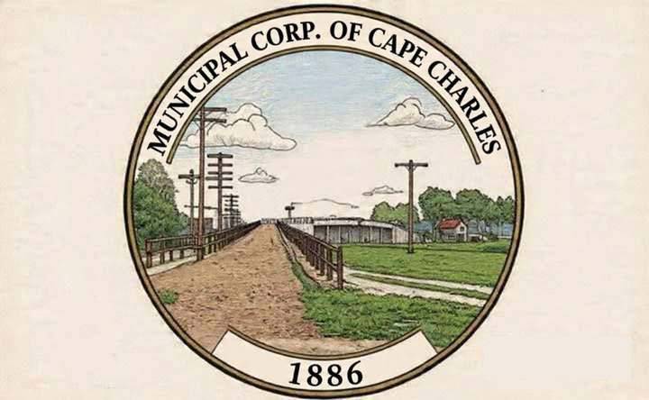
The seal shows that Cape Charles was built as an industrial powerhouse, where the railroad met the Chesapeake Bay, where freight and passengers moved between the Eastern Shore and Norfolk. That heritage of commerce, innovation, and hard work deserves recognition.
Cape Charles was established in 1886 by the Pennsylvania Railroad as the southern terminus of its Delmarva Peninsula line. The town’s deep-water harbor facilitated a bustling ferry operation that transported entire rail cars across the Chesapeake Bay, making it a crucial link in East Coast commerce until the Chesapeake Bay Bridge-Tunnel opened in 1964.
Proponents of a redesign suggest that a new seal could incorporate elements reflecting this industrial legacy — perhaps including the historic railroad pier, ferry operations, or the harbor that remains central to the town’s identity.

Awesome article. I think you hit the nail on the head with this one. %100
Don’t be afraid to speak your mind. What you feel means too much to not be said.
I think a photo of Mt. Rushmore would be just as appropriate for Cape Charles as the suggested new image for a beach front community. Not saying it’s the best I’ve ever seen but I like the one we have.
You sure talk alot. Why don’t you put your real name out here instead of hiding behind a moniker. Alot of people on here might not know who you are. But I do. Oh BTW did you know they are planning on tearing down the pavilion also? So why keep on the town seal? It’s not even as old as the hump.
You sure are a drama-queen.
So I didn’t think we were interested in preserving history!!!!!! Let’s tear down the hump, let’s re-design the beach, let’s allow STR’s to run rampant, etc.etc. Also, how much will this redesign cost the taxpayers? Change, change, change.
Nothing wrong with the current seal, from left to right. The Jetty, built for the protection of the harbor the railroad dredged. Railroad tracks even went out onto the Jetty. The beach, the boardwalk, it’s been a Beach Town since the Sea Cottage Addition, the Chesapeake Bay Deadrise, she’s the queen of the Bay, representing our commercial fishing heritage. Our Pavilion, long a focal point and gathering spot, literally the end of the road coming into town. And lastly that Chesapeake Sunset. All boxes are checked in the seal if you know where to look.
I was born in Cape Charles and spent my childhood there. I played little league baseball over “the hump” back in the day. The new logo proposed makes a fine post card, but fails to capture the all important oyster, fishing and crabbing industry history and frankly doesn’t do a great job of illustrating the importance of the beachfront, jetty or railroad. The original seal is a more accurate depiction even if it is a bit dated.
The current town seal is much better.
A great designer could tie in all the most important visual and symbolic imagery together in an updated design at some point. The proposed new design is very nice art but it’s limited in displaying the area’s gems and honestly is boring for a vacation beach town.